

5 months ago
Wednesday, May 26, 2010
CAD in Interior Architecture
Computer Aided Design (CAD) has come a long way since its initial conception. Dreams of what it could be have failed and in other aspects, it has surpassed any and all inital expectations. CAD has become an integral part of how architects and interior architects design the buildings and spaces we inhabit. In the modern world, it seems impossible to imagine designing a building or space without the help of computers. These programs may calcuate sunlight, flow and other attributes. But they also serve as a medium to design within, allowing unthought-of shapes and forms. They allow the automation of certain tasks, taking away what may be munadane and boring work. Computer cannot, however, replace the designer. The human element of design is what makes it what it is- computers are not able to realize human needs on the same level that a person can.
Wednesday, April 28, 2010
happy design & unhappy design
There are a lot of places and spaces that make me happy- which isn't to say I can't find some serious flaws with them. One of these places is the Anthropologie at Rockefeller Center in New York City. Now, of course, this may be because I debatably have a shopping addiction and I'm a fan of pretty much everything Anthropologie does in their stores and sells, but this space is pretty amazing. The store is huge and yet is divided up so that it feels somewhat homey- even despite the tourist-y bustle of Rockefeller Center just outside. I would literally just go in here and chill out because it felt good- and then walk out with a $160 jacket (it was on sale from $300!).


Now, what makes me unhappy. Well, a lot of things make me unhappy. A lot of spaces make me unhappy. And anyone who goes anywhere with me knows that the first thing I'll see when I walk in somewhere, no matter how beautiful it is, is what is wrong. (This doesn't mean I don't appreciate what is right). However, I think that if I could re-do anything, it would be somewhere that I come in contact with daily. This would be the kitchen in my apartment. It's very small, which isn't the real issue with it. The main problem is that whoever "designed" this kitchen didn't take advantage of what space is there. There is barely any counter room, appliances are awkwardly place, and some cabinets are downright difficult to get into. Not to mention, when designing a kitchen, please, I beg you, always put a place for a trash can. I would say to even put "trashcan" in the programming. In basically every kitchen I have ever been in, there's no good place to put the trashcan except under the sink or in a cabinet of it's own, which is nice, but often a tad bit too small. I basically never cook in my kitchen, not only because I don't like to cook (nor am I good at it, nor do I ever want to do dishes), but because this kitchen is so non conducive to cooking.
Now, what makes me unhappy. Well, a lot of things make me unhappy. A lot of spaces make me unhappy. And anyone who goes anywhere with me knows that the first thing I'll see when I walk in somewhere, no matter how beautiful it is, is what is wrong. (This doesn't mean I don't appreciate what is right). However, I think that if I could re-do anything, it would be somewhere that I come in contact with daily. This would be the kitchen in my apartment. It's very small, which isn't the real issue with it. The main problem is that whoever "designed" this kitchen didn't take advantage of what space is there. There is barely any counter room, appliances are awkwardly place, and some cabinets are downright difficult to get into. Not to mention, when designing a kitchen, please, I beg you, always put a place for a trash can. I would say to even put "trashcan" in the programming. In basically every kitchen I have ever been in, there's no good place to put the trashcan except under the sink or in a cabinet of it's own, which is nice, but often a tad bit too small. I basically never cook in my kitchen, not only because I don't like to cook (nor am I good at it, nor do I ever want to do dishes), but because this kitchen is so non conducive to cooking.
Wednesday, April 14, 2010
A Classmate's Design Strength
I talked to Haley Preston about her design strengths. She is a very organization-oriented person, and uses this to her advantage when designing spaces. She feels that her greatest strengths lie in laying out spaces- from the level of dividing it into rooms down to the furniture. She feels that she has a good eye for what works and what doesn't, what is appealing to the eye and what just doesn't work. She feels she is also strong when it comes to the more technical aspects of what works and what doesn't- for example where you can't put an oven or a door.
Monday, April 12, 2010
Unity Village: Phase 3: Modeling
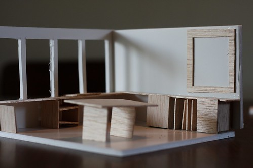
Two bedrooms in around 900 square feet isn't easy. I live in a one bedroom apartment that is 900 square feet and I often wish it was a tad bit bigger! The space becomes even more tight when trying to allow someone in a wheelchair to have adequate room to maneuver easily. After playing around with fun curved walls and knowing where rooms and spaces should lie (for example, I really wanted both bedrooms to have equally easy access to the bathroom), I came up with this floor plan.

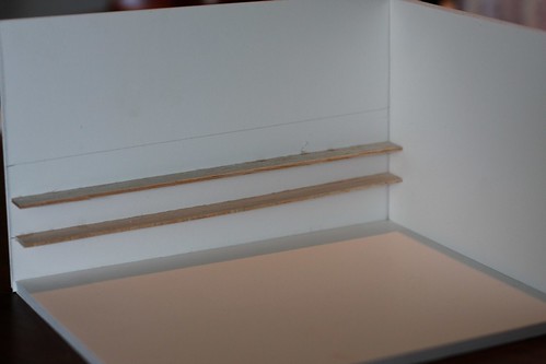
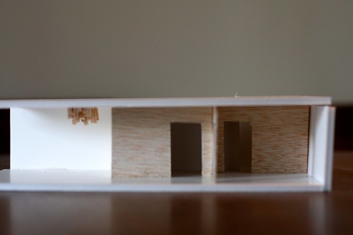
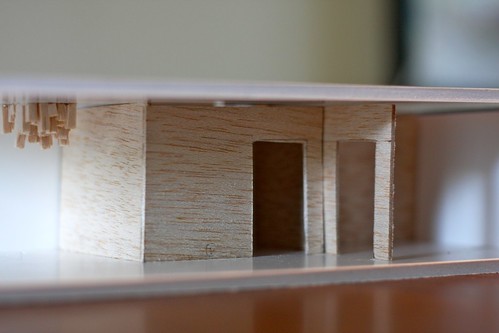
I then set about creating three models to get out some more ideas. The concept for the space has to be carried over from the previous phase of the project- Chaos and Order. I have decided that the chaos needs to happen on the ceiling, since chaos on the floor probably isn't the best thing for someone in a wheelchair- or even someone walking! The pieces of wood hanging down are an idea to create something chaotic, engage the ceiling, and define the living space from the kitchen/dining space.
thinking about book display in the living room
all books would be easily accessible by the resident.
the kitchen area
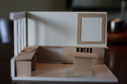
i want to leave most of the space under the counters open so that the resident can easily wheel under the counters. he eats out most of the time, so a lot of storage space isn't needed.
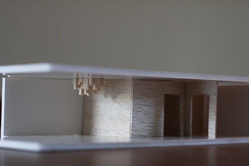
in this image you can see one way i have thought about engaging the ceiling.
I then set about creating three models to get out some more ideas. The concept for the space has to be carried over from the previous phase of the project- Chaos and Order. I have decided that the chaos needs to happen on the ceiling, since chaos on the floor probably isn't the best thing for someone in a wheelchair- or even someone walking! The pieces of wood hanging down are an idea to create something chaotic, engage the ceiling, and define the living space from the kitchen/dining space.
thinking about book display in the living room
all books would be easily accessible by the resident.
the kitchen area
i want to leave most of the space under the counters open so that the resident can easily wheel under the counters. he eats out most of the time, so a lot of storage space isn't needed.
in this image you can see one way i have thought about engaging the ceiling.
Sunday, April 11, 2010
What Makes Me A Good Designer
When I start designing a space, I never stop thinking about it. From the moment I get the assignment, I start observing everything around me and seeing how it might fit into the assignment I'm currently working on. This could be spaces I walk into or images I come across online or pictures in a magazine. Through these observations I may find out something that makes a space more user-friendly at a product level or I might get inspired in a more abstract way for what the space might look like.
I am also always using experiences I have had as inspiration, especially from my travels. Most people who know me know that I am always planning a trip to somewhere or am talking about somewhere I have been. Throughout the world, the country, the region, and the city, there are so many things to learn and be inspired by.
I am also always using experiences I have had as inspiration, especially from my travels. Most people who know me know that I am always planning a trip to somewhere or am talking about somewhere I have been. Throughout the world, the country, the region, and the city, there are so many things to learn and be inspired by.
Friday, April 2, 2010
Unity Village: Assessments
Neighborhood A
Ground Floor
This group’s design for the ground floor of Unity Village utilized strong linear geometric forms, bright and crisp colors, and unexpected use of materials to define space and add interest to the floor with the least natural light and space. Their program called for the daycare, grocery and laundry to be the main areas of this floor. Their design was very open, inviting, and invigorating due to the use of color. The bright white used on the walls not only provided a blank canvas as they said, but also added a lot of light to the space. Their interesting lighting, which at points travelled down walls, was good creative risk and worked well, creating the illusion of light pouring in through a window as well as adding the unexpected. The use of the same wood flooring on the floor and ceiling created a streamlined effect and added warmth to the space, as well as grounded it (no pun intended). I feel that the space is conducive to community, but the elderly might not find it as visually appealing as the other user groups.

First Floor
The concept of conversation utilized by this group strongly tied to community, and it shows. From this concept they achieved an inviting, fluid space. Their strongest achievement I felt was the entryway with the logo- something no other group thought about. The circles from the simple yet strong logo were utilized throughout the rest of the space. The layout and use of materials encourages movement but is punctuated with stopping places- not unlike a breath one might take while in conversation.
Second Floor
This design for the second floor incorporated a worship area, medical clinic, gym with locker room, and a library with a conference room and children’s area. While each amazing space stood out on its own, they were not cohesive as a whole. I thought that incorporating a worship/meditation area into the program was an excellent idea. It creates a place within the building to get away. Having a medical clinic means that a person could go extended periods of time without leaving the building- a very good thing if a person is sick or injured. As a severely accident-prone person, I appreciate the fact that it is on the same floor as the gym (just ask me about the time I was attacked by an exercise bicycle...). Having a library adds an intellectual touch to the building. I did not think of it at the time, but I wonder how many books the library is designed to hold and what types of books will it hold?

My Team
Hailey Allen and I created a design for the first floor of Unity Village, as can be seen in previous posts. After seeing what Neighborhood A did with the entry area, I wished we had addressed that area better. Now it seems so obvious that it deserves extra attention since it can be seen clearly from the outside before someone even enters the building. Other than this, I feel that we achieved a strong space and a place that people would want to be in.
Our biggest struggle in the process was concept. In the past, we had been honing a concept down to a single abstract word or idea that was to guide us throughout the process. Now we were asked to expand what a concept is. Though I believe that a more expanded concept makes a lot more sense, it was hard to break the confusing-one-word concept definition. However, we eventually (and thankfully) (and rejoicefully) had an aha! moment. The rest of our process, both in designing as well as portrayal through digital rendering and the physical model, went extremely smoothly.
I feel that we used “design thinking” in our process. We were concerned with the residents of the building as a community and what their experiences might be like. I often think of this building also as a neighborhood within itself. It has the neighborhood coffee shop, the neighborhood post office, the daycare, etc. The physical things one would find within a physical neighborhood. By creating this sub-neighborhood within the greater neighborhood outside the building, I feel that community is fostered among the residents. The places in a neighborhood give people a chance to interact, see the same people again and again, and thus make connections between one another. With these connections come tolerance and understanding between the diverse residents of this building. It is working as a system, and “design thinking” is about systems, especially community systems.
Ground Floor
This group’s design for the ground floor of Unity Village utilized strong linear geometric forms, bright and crisp colors, and unexpected use of materials to define space and add interest to the floor with the least natural light and space. Their program called for the daycare, grocery and laundry to be the main areas of this floor. Their design was very open, inviting, and invigorating due to the use of color. The bright white used on the walls not only provided a blank canvas as they said, but also added a lot of light to the space. Their interesting lighting, which at points travelled down walls, was good creative risk and worked well, creating the illusion of light pouring in through a window as well as adding the unexpected. The use of the same wood flooring on the floor and ceiling created a streamlined effect and added warmth to the space, as well as grounded it (no pun intended). I feel that the space is conducive to community, but the elderly might not find it as visually appealing as the other user groups.
First Floor
The concept of conversation utilized by this group strongly tied to community, and it shows. From this concept they achieved an inviting, fluid space. Their strongest achievement I felt was the entryway with the logo- something no other group thought about. The circles from the simple yet strong logo were utilized throughout the rest of the space. The layout and use of materials encourages movement but is punctuated with stopping places- not unlike a breath one might take while in conversation.
Second Floor
This design for the second floor incorporated a worship area, medical clinic, gym with locker room, and a library with a conference room and children’s area. While each amazing space stood out on its own, they were not cohesive as a whole. I thought that incorporating a worship/meditation area into the program was an excellent idea. It creates a place within the building to get away. Having a medical clinic means that a person could go extended periods of time without leaving the building- a very good thing if a person is sick or injured. As a severely accident-prone person, I appreciate the fact that it is on the same floor as the gym (just ask me about the time I was attacked by an exercise bicycle...). Having a library adds an intellectual touch to the building. I did not think of it at the time, but I wonder how many books the library is designed to hold and what types of books will it hold?
My Team
Hailey Allen and I created a design for the first floor of Unity Village, as can be seen in previous posts. After seeing what Neighborhood A did with the entry area, I wished we had addressed that area better. Now it seems so obvious that it deserves extra attention since it can be seen clearly from the outside before someone even enters the building. Other than this, I feel that we achieved a strong space and a place that people would want to be in.
Our biggest struggle in the process was concept. In the past, we had been honing a concept down to a single abstract word or idea that was to guide us throughout the process. Now we were asked to expand what a concept is. Though I believe that a more expanded concept makes a lot more sense, it was hard to break the confusing-one-word concept definition. However, we eventually (and thankfully) (and rejoicefully) had an aha! moment. The rest of our process, both in designing as well as portrayal through digital rendering and the physical model, went extremely smoothly.
I feel that we used “design thinking” in our process. We were concerned with the residents of the building as a community and what their experiences might be like. I often think of this building also as a neighborhood within itself. It has the neighborhood coffee shop, the neighborhood post office, the daycare, etc. The physical things one would find within a physical neighborhood. By creating this sub-neighborhood within the greater neighborhood outside the building, I feel that community is fostered among the residents. The places in a neighborhood give people a chance to interact, see the same people again and again, and thus make connections between one another. With these connections come tolerance and understanding between the diverse residents of this building. It is working as a system, and “design thinking” is about systems, especially community systems.
Thursday, April 1, 2010
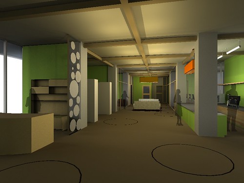
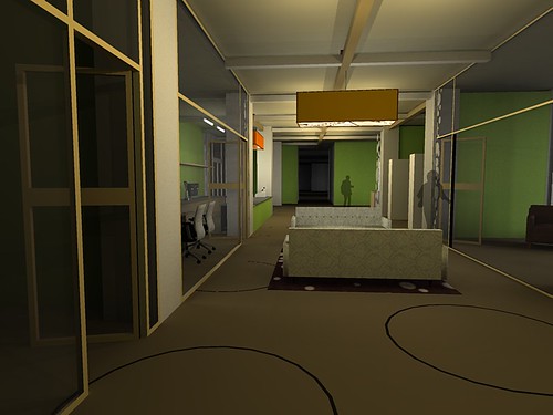
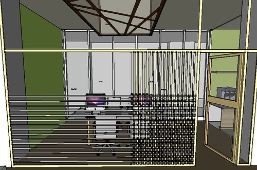
Unity Village: First Floor: Process Podium Renderings
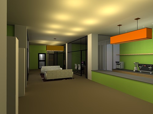
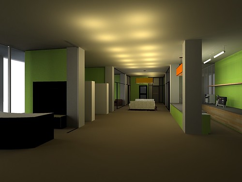
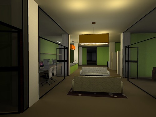
Though this is not a podium rendering, I wanted to include it as part of process in trying to figure out something to do with the windows. The room seen here is the computing room, where residents would have access to computers and the internet.
Unity Village: First Floor: Dimensioned Floor Plan & Reflected Ceiling Plan
Floor Plan

Reflected Ceiling Plan

Reflected Ceiling Plan
Subscribe to:
Posts (Atom)